 Skip navigation

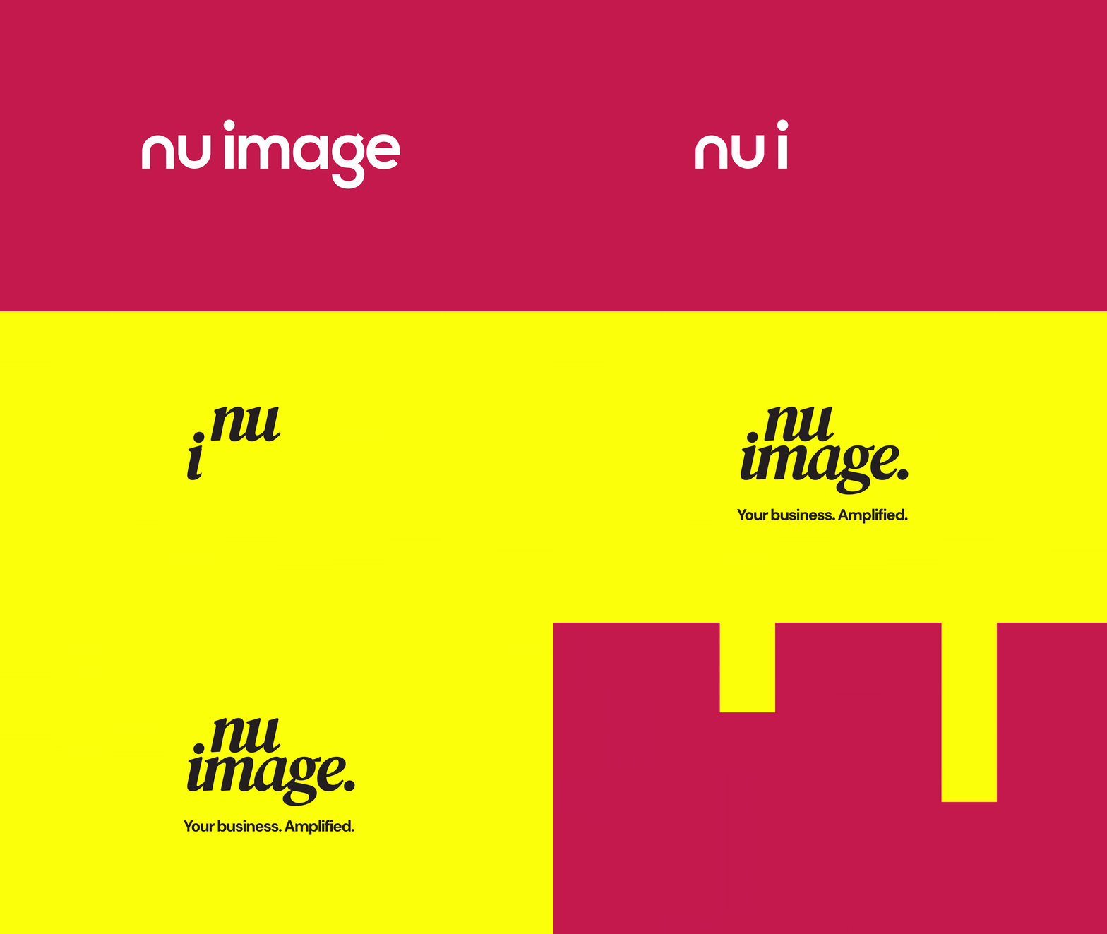
Back in February, we launched our rebrand. Eight months on, here’s how it’s going.
For nearly 12 years we proudly donned our red and white. It was playful and loud, but also approachable and people remembered it. It served us brilliantly, but somewhere along the way the business grew up, and it was time to leave behind the brand that got us here and craft something that would take us forward.
Working on a rebrand internally taught us a lot. We had to pull out all the stops to keep the buzz going long after launch day, and it asked a lot of the whole team. It also gave us a fresh appreciation for why it’s worth doing properly, and why it might be time to think about yours.
The inspiration:
Ian started Nu Image from his spare bedroom in 2007, and a lot has happened between then and our bustling Norwich studio today. As we’ve grown, everyone in the team has settled into their specialisms and really come into their own. We’ve seen trends come and go and worked with a varied roster of both B2B and B2C clients, picking up plenty of tricks along the way. Our old brand captured the energy we started out with, but no longer reflected the depth of experience that we bring to the table.
That experience has changed how we work with clients, too. Marketing has to earn its keep, so every strategy we build now ties back to business objectives from the outset. We wanted people to see us as a partner for growth rather than “someone’s marketing agency”, and we needed a brand that said so. Something confident without needing to shout, that would feel right at home with businesses ready for their next step.
Enter navy and yellow, paired with bold sans serif type and italic serif flourishes. The yellow brings the sunny outlook we’ve always had, and the deep navy gives it boldness and impact. We haven’t lost our eye for style either. The spirit that made the old brand so memorable is still there, it’s just grown up a little.
As with any good rebrand, the visuals were only the start.
“The red has always given us a punchy identity that stands out, but always had two elements that didn’t sit well with us. Firstly, red tends to lean towards discount or sale, and that is not what we are. Secondly, red in terms of a digital marketing reports symbolises decline, and again, that is not something we want to associate with our identity. This is the reason why we decided to make the big step of overhauling the brand identity from top to bottom. In a more conventional brand refresh we might have considered a bit more continuity to ensure anyone who is loosely aware of us keeps that awareness.
The reality is that with the fast paced change within our industry over the past 24 months we have reviewed and developed every part of our offering. Rather than fearing what threats AI brings we relish the new possibilities that new channels bring, and in a world getting saturated by bland AI slop, we are heavily embracing our human creativity and personality. This refresh was all about confidence. Confidence in our marketplace. Confidence in the future. And confidence in ourselves.”
Ian Howes, Founder and Creative Director, 2026
Not just a logo
We’re not here to teach you to suck eggs, but it needs saying: a rebrand is so much more than a badge swap. We’ve led plenty of rebrands for clients over the years, but going through it ourselves was a different kettle of fish. Being on both sides of the table showed us just how much goes into it.
Branding is three dimensional, and it only really works when it’s consistent everywhere your business shows up.
On screen (online): your website, socials, email signatures, newsletters, Google Business Profile, Linkedin page, pitch decks and proposals, video intros and thumbnails.
On paper (print): business cards, report covers, letterheads, brochures, and anything else you post out to clients.
Out in the world (physical): signage, vehicle livery, studio interior, branded merchandise, event stands.
So why go to all the trouble? Because every time someone comes across your brand, it should feel like the same business. Show up consistently across every channel and you build a presence people recognise at a glance, which is how a brand eventually becomes iconic. It also earns trust. A business that looks put together everywhere comes across as one that has its act together, and credibility goes a long way when you’re up against competitors who haven’t made the same effort.
Signs it might be time for yours
The need for a rebrand isn’t always obvious. Brands tend to fade gradually rather than overnight, so it’s easy to miss the moment yours stopped pulling its weight. Here are some tell-tale signs to look out for.
- Your business has evolved, but your brand hasn’t. Maybe you’ve grown your service offering, moved into a different marker, or set your sights on bigger clients since you first launched. If your brand is still describing the business you were five years ago, it’s selling an old version of you.
- It’s looking a bit tired. Design moves on, and a logo that felt fresh a decade ago can quietly start to date you. No judgement, it happens to the best of us.
- You wince handing over a business card. If you find yourself apologising for your website or leaving the brochure out of a pitch, that’s a pretty big clue your brand isn’t doing you justice.
- It looks different everywhere. A slightly different version of a logo on signage, a social template that someone has knocked up in a hurry, or a tone of voice that has multiple personalities. Over time these little inconsistencies add up and chip away at your online presence.
- Your leads have dipped. A drop in conversions or a nagging feeling that competitors are leaving you behind can have plenty of causes, but an outdated brand or website is often a key factor.
- You’re attracting the wrong customers. If the people getting in touch aren’t the one you want to work with, your brand might be talking to the right audience.
Ticked a few of those off? You’re in good company. We recognised more than one in ourselves, and it’s exactly why we took the leap.
What it did for us and what it can do for you
As the buzz grew after our rebrand launch, the first thing we noticed was the conversation. Clients old and new got in touch to tell us what they thought of the new look, and a few familiar faces we hadn’t heard from in while popped up to say hello.
Since launch, we’ve secured new partnerships, welcomed new clients, and our social presence has grown significantly.
When a rebrand is done properly, the wins go well beyond a fresh lick of paint. It changes how people see you, giving your business the credibility to hold its own in bigger rooms. It also builds a presence people recognise long after they’ve scrolled past. You get something genuine to shout about, which is always great news for your PR. And for your existing customers, it’s a reminder that you’re still moving forward and evolving to give them the best possible service.
The process
Our brand consultations put a lot of weight on brand positioning and perception, looking at where your brand sits in its market and how people currently see it. Before we put pen to paper, we’ll sit down with you to talk through your target audience, market and the value you offer. These conversations subtly shape each creative decision that follows, placing influence on your colours, typography and visual style, and later on in the journey, your tone of voice.
Design gives your brand its look. We develop your logo, colour palette and typography, then carry them through brochures, signage and social graphics so that your brand feels consistent wherever people come across it.
A logo has to work adapt across every channel it appears on, so presentation plays a key role in our design process. If it’s going to sit on a billboard or the side of a vehicle, we’ll factor that in from the outset. Refreshing an established brand calls for a lighter touch, and our work with the BRSCC is a good example of refreshing a heritage brand while carefully preserving what is iconic about it.
Development brings it to life online. Our developers build bespoke websites with no templates to hold them back, shaped around your users and their journey, with a few interactive features and flourishes that make the most of your new identity.
Copy gives your brand its voice. Our copywriters will craft a tone of voice and brand narrative that lifts you off the page and connects with your audience. It works best when it carries through everything you put out, from your website, blog articles and socials to everyday business communications.
By the end, you’ll have everything you need to launch. That might mean brand guidelines, a tone of voice guide, logo files, social templates, marketing materials, letterheads or email signatures, depending on what your business needs. And if you’d like a hand spreading the word afterwards, we’re happy to help with that too, through SEO, social or paid campaigns.
Comfort zones don’t grow businesses.
We won’t sugarcoat it. It’s been a tough few years for businesses, and when budgets are tight, the temptation is to keep your head down and stick with what you know. But sometimes you have to take a step back to take a step forward.
The digital landscape has shifted massively, and it’s moving. The way people find, research and choose businesses looks very different to how it did years ago, and your brand deserves the chance to keep up with it.
A rebrand is nothing to feel sheepish about. Sometimes it’s a chance to fix what isn’t working and start afresh. Other times it comes from things going really well, and a business that’s simply outgrown its old look. Either way, it shows you know who your business is and where it’s heading, and you’re giving it the room to grow. We’d know. Nearly 20 years, ours has been the best decision we’ve ever made.
Could it be time for your rebrand?
If any of the above has struck a chord, we’d love a chat, and the kettle’s always on in the studio. Call us on 01603859007 or send us an enquiry to get a brand consultation booked in.