One by one football clubs are catching up with the modern world and jumping on the trend of minimal logos. Norwich City are next to tackle (pun not intended) their crest and have unveiled a new design for the first time in 50 years.
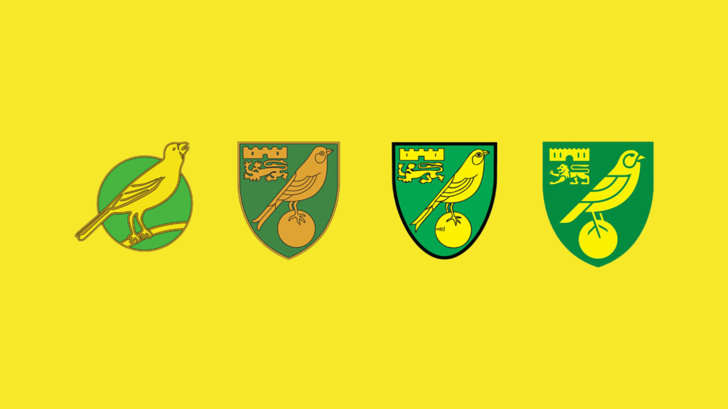
The project was carried out by the design agency Someone, who have had success with the rebrands of both Wolves and Aston Villa. Designing a new crest for a Football Club is one of the hardest tasks a designer can face. Supporters treat their clubs like a religion and have a strong connection with their club’s crest, so it is important to find the balance between the club’s vision but also the supporters personalities.
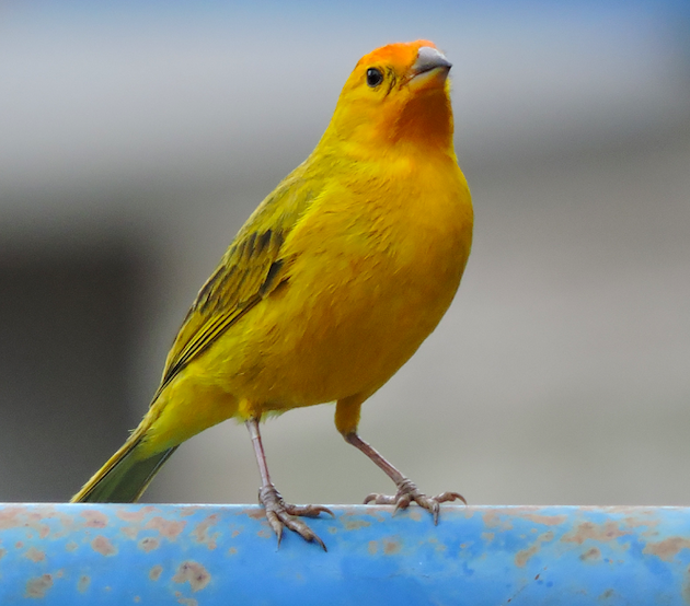
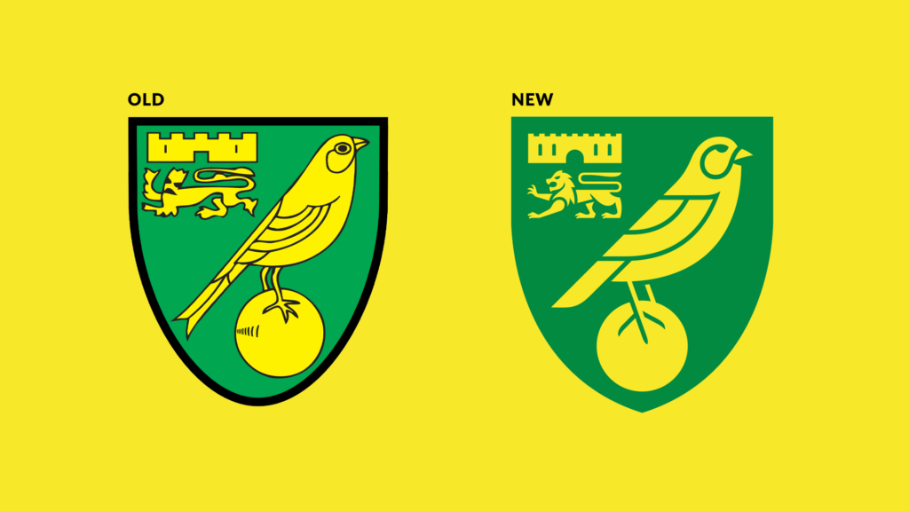
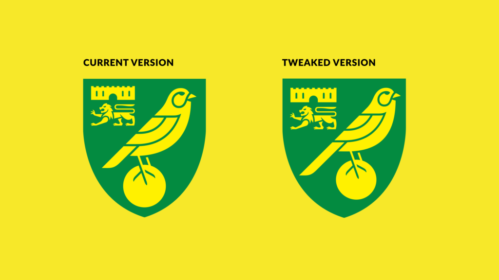
Someone Agency have made the smart decision of evolving the existing crest by keeping all the key historical elements (lion, castle and of course the canary) but simplifying them. The lion has had the biggest makeover of them all. Other notable tweaks are the removal of the black outlines which helps modernise the branding and solves the inconsistent line weights that the old crest had. Along with this the position of the ball has now been centred (we will get back to this point a bit later).
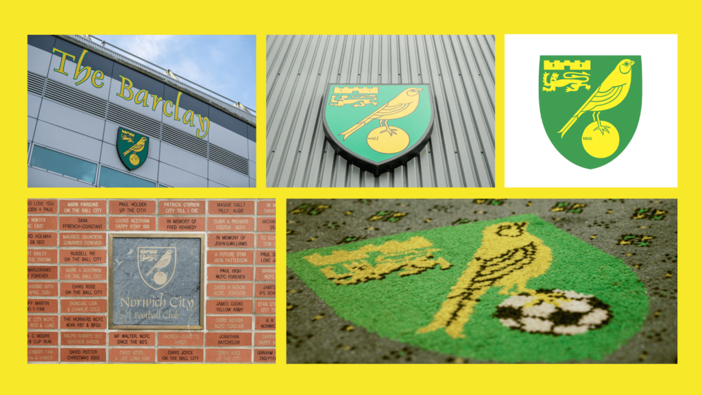
The key to any branding is consistency which, in our opinion, is something the club has had issues with over the years. Looking around Carrow Road you will see numerous versions of the crest. Your logo should never change and must remain consistent across all marketing materials to build that all important brand awareness. You could argue that the best logos/branding have an element of flexibility e,g the MTV logo, but the key elements and style should stay the same, making them instantly recognisable.
The general consensus from supporters has been positive and we’re in agreement. But as creatives ourselves we couldn’t help but give this logo a little analysis. If we had to be fussy, which we do for the sake of the article of course, our only tiny niggle is the placement of the ball. We understand that by centering the ball it is supposed to give the overall crest an even balance but we feel the proportion of the iconic canary itself looks a tad… off. By moving the ball to the centre, the size of the tail has been slightly reduced resulting in the legs being pushed. The results have caused our little canary to look a little top heavy. Just for fun we have created a slightly tweaked version of the crest to showcase the canary slightly to the right.
Don’t get us wrong! Someone Agency have nailed the brief and have designed a clean, minimal crest that keeps the heritage alive, whilst including that much needed modern twist.
The new crest has now been officially released and like all rebrands it will take a while for the new look to set in, let’s just hope it’s a good luck charm and brings Norwich City a bit of success!
Agree with our analysis and are in need of a new logo yourself? Well you’re in luck! As a full service agency we offer in-house logo design so get in touch with us today on 01603 859007 or let us know a little more about what you are looking for through our contact form!