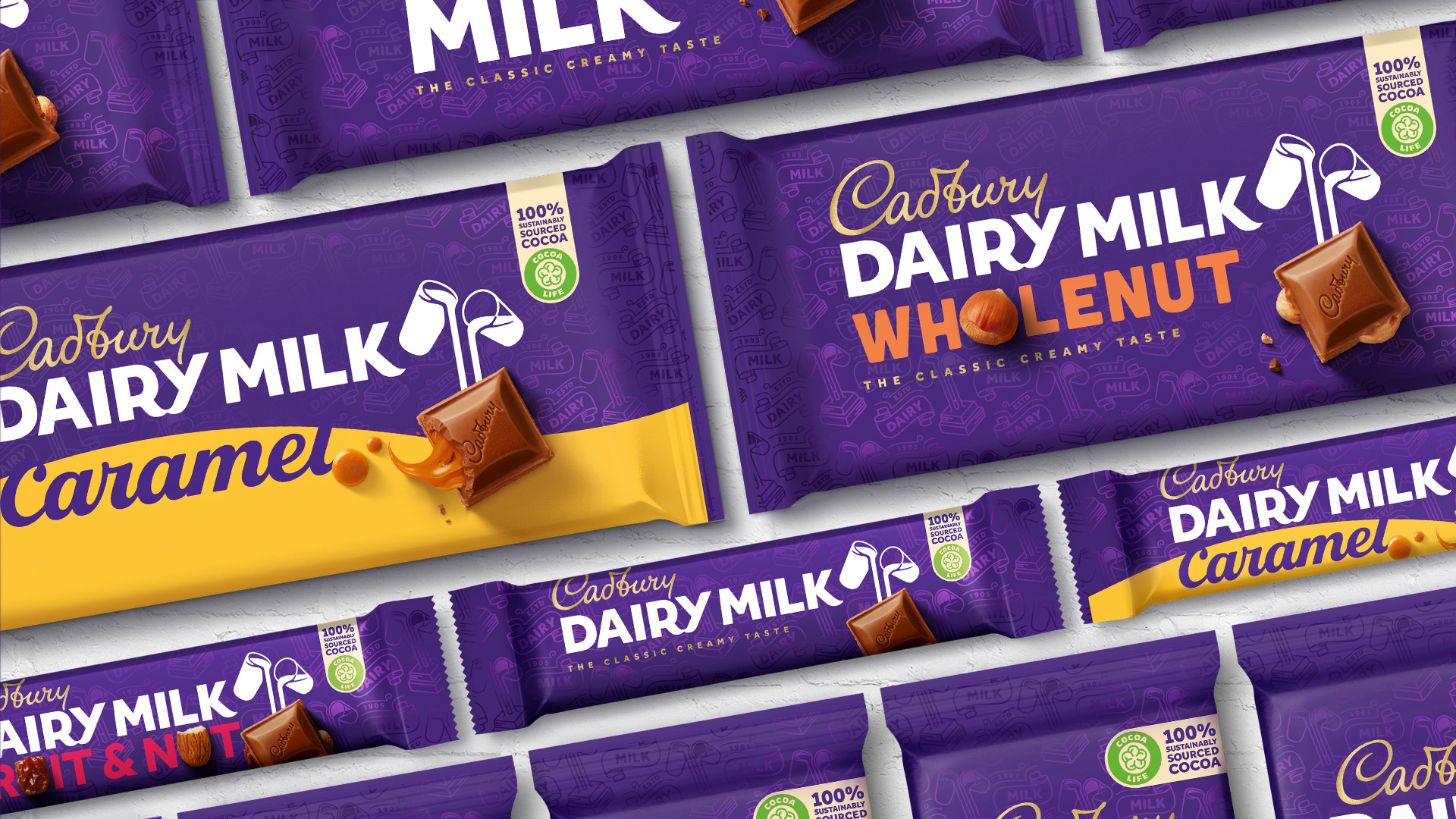
British icon Cadbury has revealed a new identity, harking back to the brand’s heritage. This is the first large scale brand overhaul the company has undertaken since the 1960s.
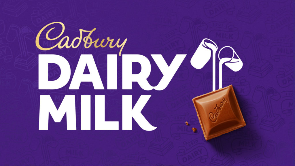
Led by international design studio Bulletproof, the new creation features a recreated word-mark, reflecting the signature of the founder’s grandson, William. Along with an updated version of the famous “glass and a half” icon, this time incorporating the drawn elements alongside the chocolate itself, to connect the branding with the product.
Bulletproof explained that they wanted to capture the “warmth, humanity and authenticity” of founder John Cadbury, with the new look.
As with any attempted rebrand of a well-loved, household name, the new Cadbury logo and supporting icons, sparked some criticism when covered in the UK Press.
Headlines sensationalised the project costs and broadcasted that critics felt “They’ve just tilted the writing and made it lose a bit of weight.”.
We are not here to fuel that fire. On the contrary, our designer Stephen is a fan of the subtle changes Bulletproof have implemented during the Cadbury rebrand;
“I love the new look, it has a nice blend of heritage and modernity. It’s a subtle redesign that may go unnoticed by some, but it’s these tiny updates which are so important to keeping brands feeling fresh.”
The design world generally agreed with our very own Stephen, and despite the lukewarm reception across Twitter and the press, the team at Bulletproof stood strong in their response. Global creative director at Bulletproof, Nik Rees stated;
“Everything you do as a designer starts with consumer insight, so the fact that at the endpoint, tabloids and their readers were rubbishing the designs is funny, because they’re the kind of people we gleaned insight from in the first place,” he says. “It’s only when the media spike and sensationalise that people tend to get frenzied.”
Nik Rees
Using Heritage to Support the Designs of Tomorrow
New creative direction, often finds itself looking back to a company’s heritage for new inspiration. Whilst it is important to move forward and for brands to progress, for those that have a longstanding history and a positive following, it is fundamental that this should be reflected in new branding rather than forgotten. Often, it is this revisiting of heritage and fond history, that can relight a brand that may have lost its way or who’s brand perception has shifted dramatically.
This was the case in recent years for Burberry. Established in 1856, this was a brand who’s style and heritage had always been associated with high end, quality fashion. In more recent times, the brand became “too popular”, and instead of a fashion label for the elite, found itself donning the masses and in turn being replicated on marketplaces worldwide.
For their “rebound” they needed something dramatic, yet timeless and true to their heritage. Their relaunch came in 2011, when they entrusted Kate Moss and Emma Watson to become their new fashion ambassadors. Paired with the prior released new monogram, designed by Peter Saville, the brand defied the doubters to reestablish its name in the fashion industry. The monogram uses the initials of the company’s founder Thomas Burberry as the basis, harking back to their heritage – just as Cadbury have done with the new evolution of their brand.
Given the stigma surrounding the brand, it would have been easy to take steps to remove themselves from the original design staples of check and trench-coats, but, rather than forget their past, they revitalised it. In turn, their audience reconnected with what they do best.
Reminding their existing clients and a new generation of buyers, exactly why they loved Burberry in the first place clearly worked, as sales rocketed.
It was a moment of successful rebranding that managed to modernise the brand, all the time, staying true to its heritage.
The MAYA Principle
Of course, whenever a fresh look is unveiled for a household name, everyone has an opinion regarding the perceived success of the new design. For us as creatives, we love to see the new direction that a brand has been taken in, and how the changes touch and affect their audience.
Raymond Loewy (1893-1986) is renowned as one of the most influential design experts of all time. As the creator of The Air Force One logo, the Coca-Cola bottle, the Shell Oil logo, the US Postal Service logo and the Greyhound logo, it’s certainly not a track record that we can dispute the quality of!
Loewy believed that the secret to great, and importantly, widely accepted design was to design for the future, whilst being mindful to deliver new design gradually. He coined this approach the “MAYA principle”, an abbreviation for “Most Advanced. Yet Acceptable.”. He designed products and logos carefully, to ensure that whilst they were advanced enough to have presence, they were familiar enough to ensure their audience were able to relate to and embrace the creation.
“The adult public’s taste is not necessarily ready to accept the logical solutions to their requirements if the solution implies too vast a departure from what they have been conditioned into accepting as the norm.”
R.Loewy
The new Cadbury logo reflects the MAYA principle perfectly, with the recreated logo taking inspiration from an original signature of John Cadbury’s grandson. This same signature, which has been used and adapted in Cadbury’s branding over the years, first appeared commercially back in the 1920s, when it was used on the back of the company’s trucks.
The new design retains, of course, the iconic purple packaging, which may be a blessing, considering the lengths the company went to during a High Court battle back in 2012, granting exclusive rights to the use of their signature Pantone 2685C!
Rebranding authentically
A rebrand is a big step, but if done correctly, in a considered manner, it can be extremely worthwhile.
Design has seen a shift in recent years, with top design agencies and freelance creatives feeling less driven to out-do one another. Gone are the days of creating off-the-wall logos, that are unrecognisable from anything that has been seen before.
Nowadays, there is also less of a tendency to blindly follow fashion and trends, such as a few years ago when all major brands seemed to want to incorporate a gradient into their designs! Needless to say, it’s not something that has stood the test of time!
When creating a logo, time and consideration should be given not to what your nearest competitor is doing, rather to reflect your differences. What makes your brand unique? What makes you special? Your new logo design should reflect your authenticity, values and importantly your personality. This will allow you to attract the audience that suits your own values, which in turn leads to lasting business relationships.
It is vital that logo’s stand apart from the competition and show their distinctiveness.
No matter the size of your organisation, as long as you have a clear brand vision, you are able to highlight your potential and heritage with a rebrand, just as Cadbury have achieved.
As ever, we are here to help you on your journey. If you are interested in finding out more about a company rebrand, call us on 01603 859007 or via our contact form.
Despite working remotely right now, we are here to answer your enquiries, and it will be a welcome distraction from all this chocolate talk!