
Red has been used by leading brands for many years. It is still considered a bold choice, but where exactly is its place in the market? Does it evoke feelings of discount or luxury?
Interestingly, the colour red has many connotations associated with it, symbolising both positive and negative feelings. In conjunction with impacting our feelings, red is also known to stimulate sensations such as enhanced metabolism, raised blood pressure, boosted appetite, and increased respiration rate. Being the boldest colour in the spectrum, red is responsible for rousing our most intense emotions such as excitement and passion, hence why many of the big dogs are fond of using it in their branding and advertising.
In addition to powerful emotions, red can also signify boldness, taking action, danger and warning.
With this in mind, there is scope for a variety of industries and companies to use red in their branding, no matter their target. Indeed, this is all entirely dependent on the message they wish to emit to their customers and in turn, the feelings they are aiming to elicit from said customers.
Thanks to its impact, many brands opt for red when it comes to advertising sales and discounts, but does that mean using red immediately cheapens your brand?
Here at Nu Image, we tend to think not, in fact some of the most recognisable international companies in the world use red in their branding with the plan to leave a lasting impact or a luxury connotation.
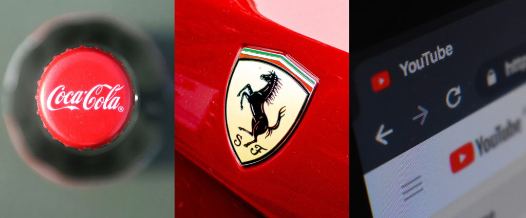
Coca Cola
Iconic for their fun adverts, Coca Cola are ambassadors for promoting youth and fearless behaviour. The fizzy drink giant uses the colour red in their branding to ignite happiness and joy for everyone and anyone who drinks their product. Despite what you may think, this isn’t a move to target only a young audience. The aim is to make the elderly feeling young again, the young to encompass everything that makes them young, and for everyone in between to feel connected.
Ferrari
Founder and entrepreneur, Enzo Ferrari, was passionate about constant improvement to be the best of the best in the motorsport industry. Ferrari’s red was born from the time when racing teams raced in national colours – red being the national colour of Italy – and has now become as synonymous with the Ferrari brand as the prancing horse which adorns each yellow badge.
YouTube
As the leading video-sharing website in the industry, YouTube is iconic for the red play button, specifically chosen for users to carry out said action and play the videos featured on the site. The increased popularity for this platform has turned YouTube into a money-making hub for vloggers (video bloggers) all around the world. Therefore, the need to encourage users to carry out certain actions that will influence their own, and vloggers income, is crucial.
Louboutin
Christian Louboutin designed the iconic red-soled shoes out of passion and conviction to create a fearless brand with a dash of eroticism. Originally sought after and worn by high profile successful women and socialites, these shoes quickly racked up a considerable worth. Nowadays the red sole oozes expense, luxuriousness and sex appeal from any woman who wears them.
Kit Kat
It’s commonly known that the colour red is used to spike feelings of hunger, but surprisingly, this is not the reasoning for Kit Kat’s choice to use the colour in their branding.
Contrary to the
aforementioned brands, the confectionary company chose red simply because it
was the cheapest dye available.
Using cheap ingredients such as sugar and wheat flour to make the wafer and reusing mashed up defect Kit Kats as the creamy filling, Kit Kat was created to target the working class. In this case the red in the branding symbolised an affordable product. Despite this, the Kit Kat has remained a staple in British lunchboxes and cupboards, standing up against its competition since 1935.
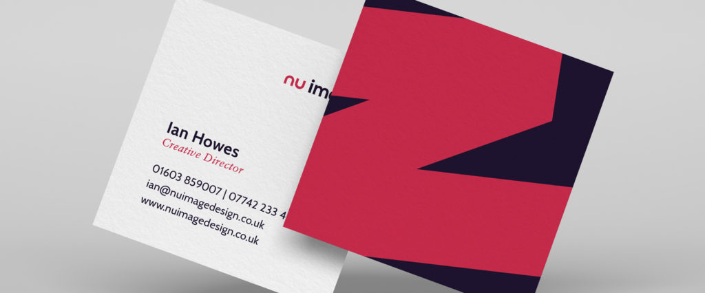
Why do we, Nu Image, use red in our branding?
Our creative director, Ian Howes, is the brains behind our own branding. Opting for a tone of red as the core brand colour, whilst some may perceive this as a bold choice, Ian explains the intricate details as to why this works well with our brand values and message;
“Red is often associated with discount products and sales and so can be perceived as a cheaper colour, but this is just because of its impact. Red demands attention. That is why it is also used for warning signs on the road, to highlight alerts on website forms and for a vast number of warnings and flashes in between. When updating our branding back in 2012, we settled on red as our primary colour to grab attention and have stuck with it ever since. For us, it is warm, welcoming and purposeful. Providing us with an identity that stands out online and on vehicle signage alike. We do try to be selective where we use it and have softened the tone slightly as opposed to using a solid, classic red, making it even more unique to us. More recently we have paired the red with our deep, rich purple. The juxtaposition of the two colours gives us quite an unusual and distinctive combination, something we will continue to evolve in coming months and years.”
So, there we have it! Red doesn’t always have to cheapen your brand, providing you use it correctly.
Used wisely, red really is the new black.
If you are
searching for your own new identity, our creative agency would love to help.
Call us today on 01603 859007 or email us on hello@nuimage.co.uk