What We Did Putting our money where our mouth is
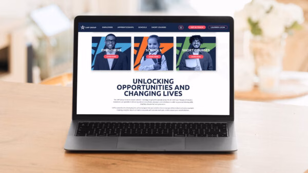
A great way to lead a user through a complex website? Colour. LMP’s new brand colours served to create a paving system, to walk the user through the site with clear sign posts.
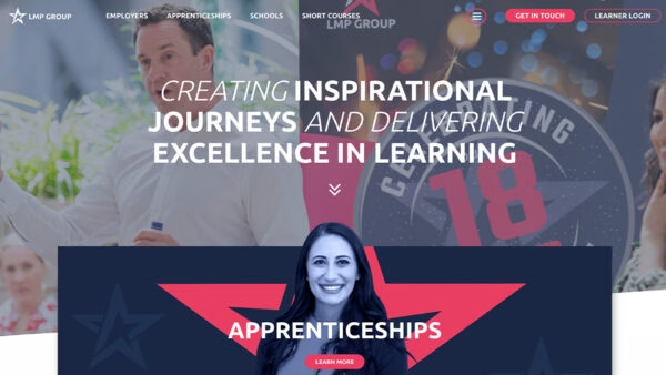
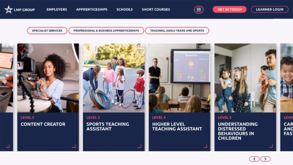
We segmented the site into 4 main user journeys; Apprenticeships, Employers, Schools and Short Courses. When the user navigates to an Employer page all clickable elements turn into their branded blue. Schools turn orange. Short Courses flag up green. And all Apprenticeship services are pink.
Whilst these are all standalone services, there are certain areas where they overlap; for example, some employers might be looking to upskill their current staff or hire an apprentice. To account for this, we added a parameter which meant that if you navigate to an apprenticeship related page from Employers, the main call to action colour would remain the colour it was on Employers. This meant that we could provide a clear separation between each sector and user journey, but adapted it so it would facilitate any crossover.