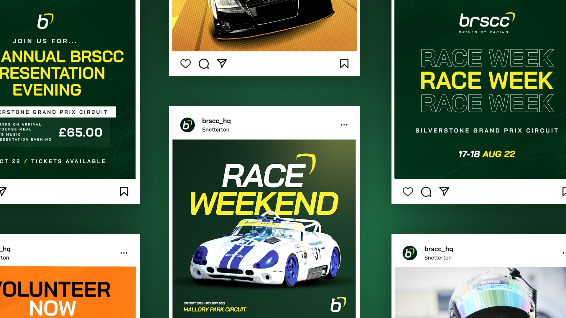
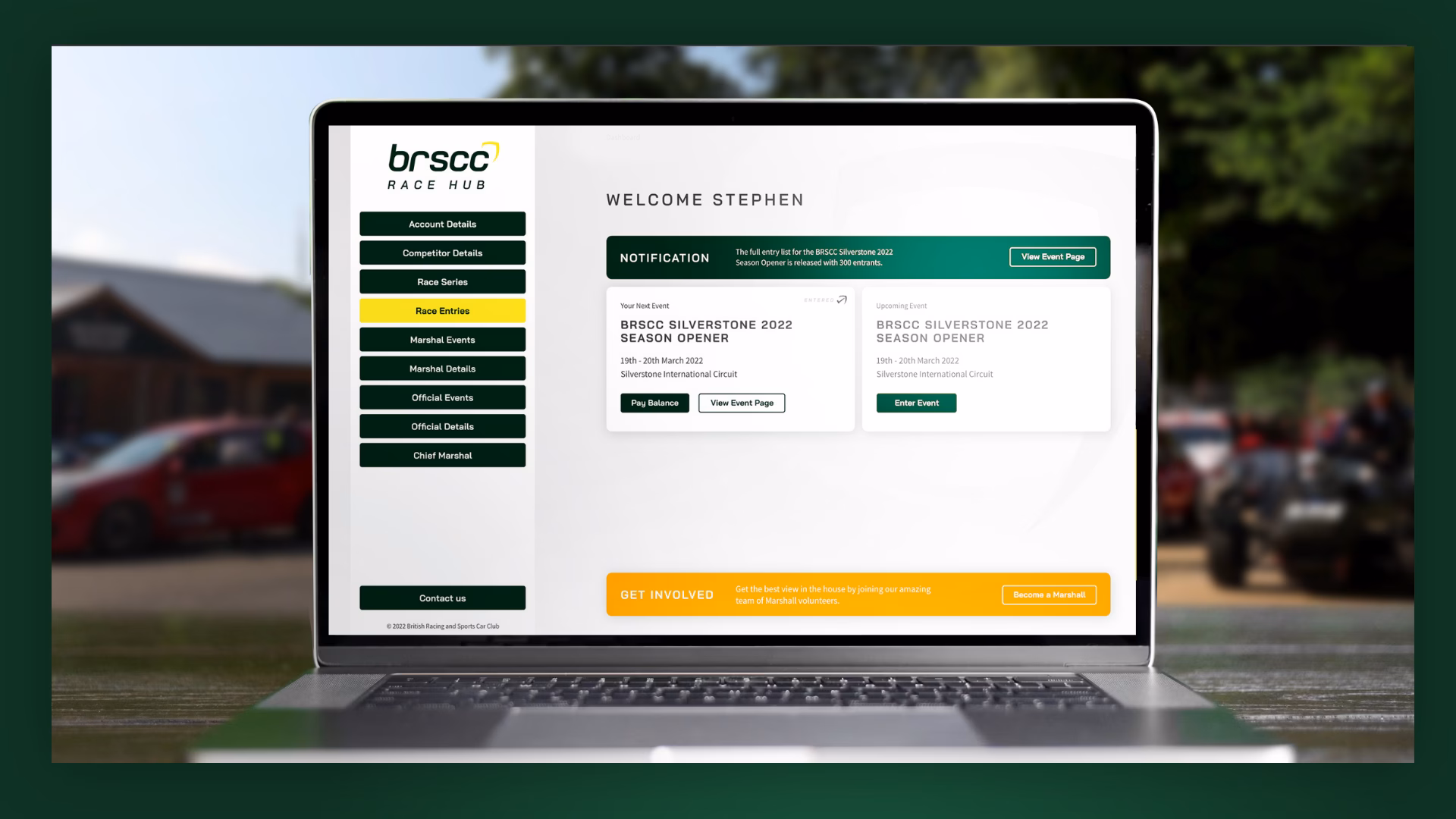
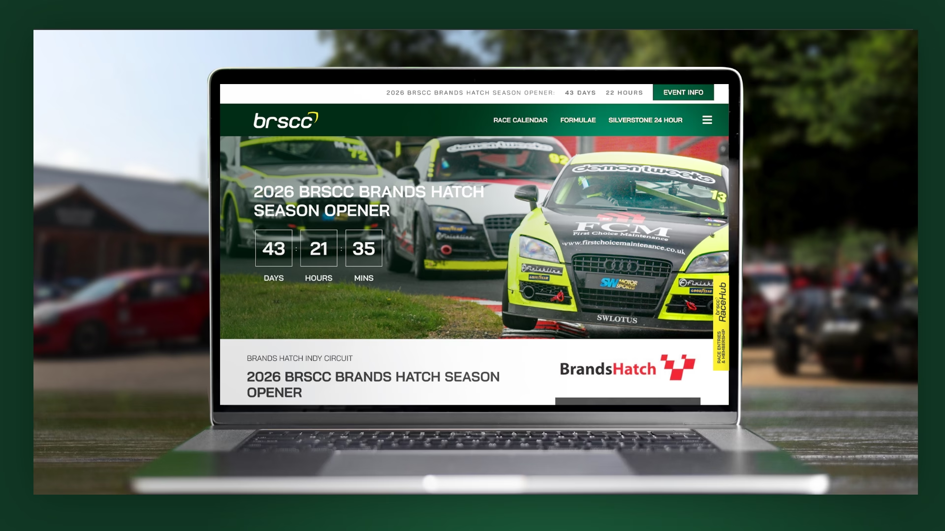
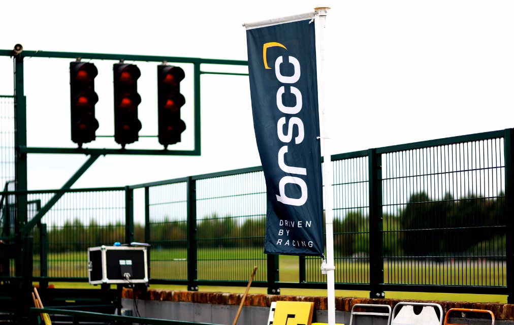
Skip navigation
BRSCC

Refreshing a 74 year old motor racing icon for BRSCC

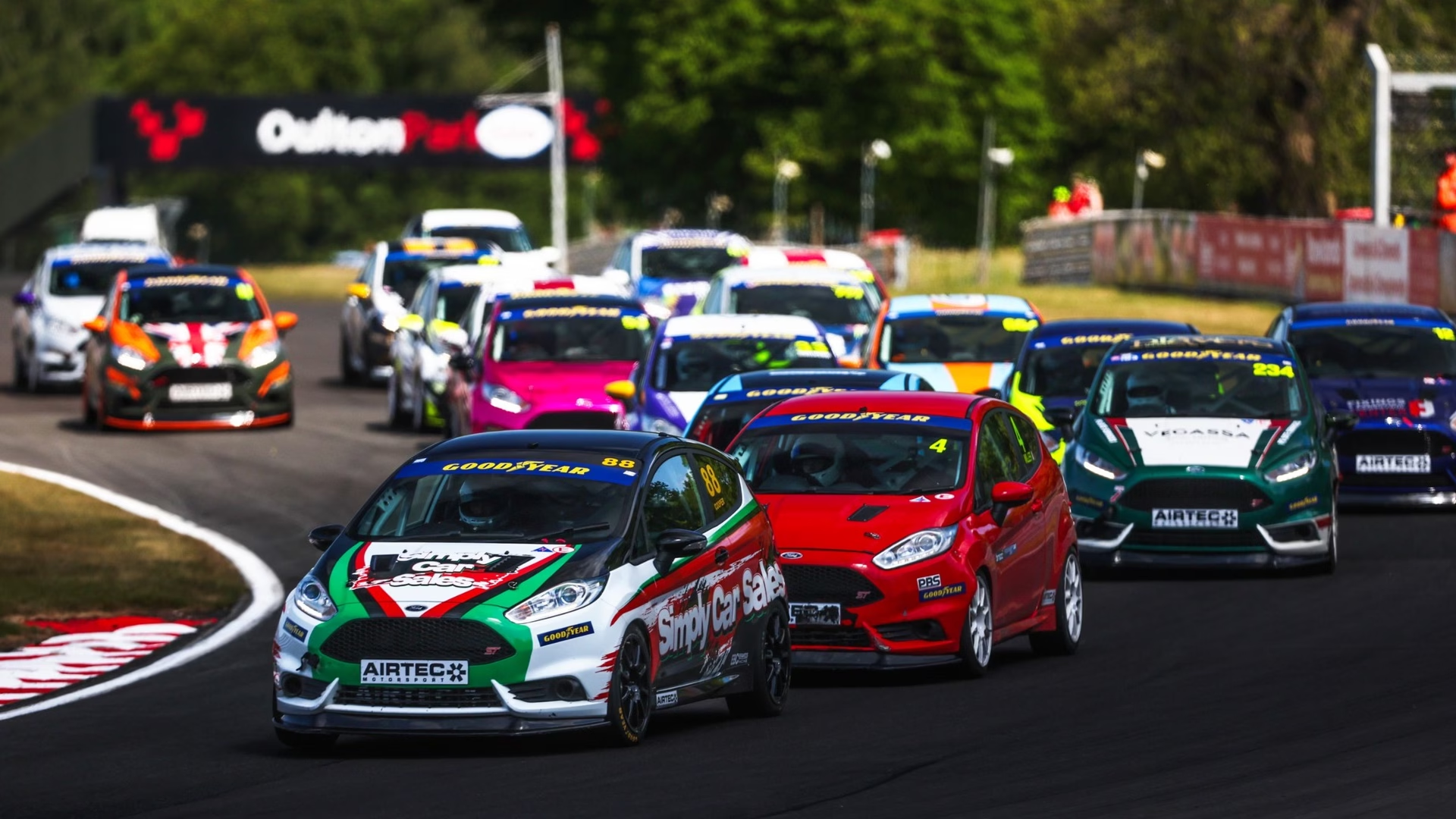
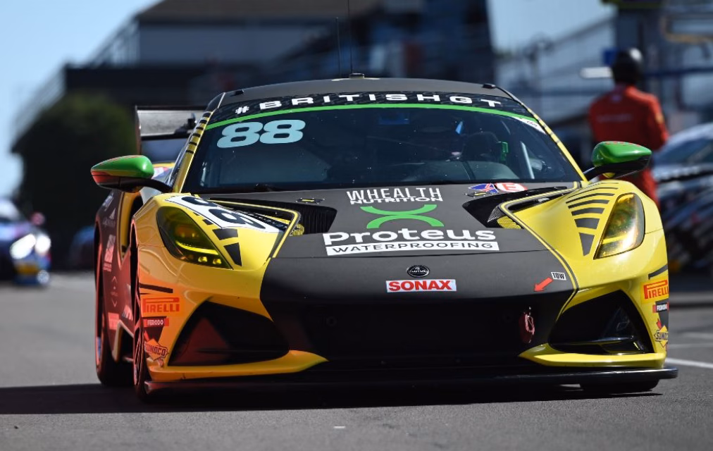
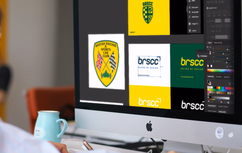
The British Racing and Sports Car Club was formed in 1946, and has been at the forefront of UK Motorsport ever since. Born from a love of cars and competition, the club has developed to the point where it organises 25 race weekends a year, working with partners such as Motorsport UK, Ginetta and British GT.

The Goal

In spite of all the change, the club was still utilising the same crest which had been created back in 1946. It was a proud symbol, representing the heritage of the club for many, but while it showcased the prestigious history, it didn’t present the British Racing and Sports Car Club as the leading organisers they are. In a world where the British GT series welcomes the very latest Porsches, Ferraris and Lamborghinis, the crest looked misplaced on the side of each car.

The goal was to create the first rebrand in the club’s 74 year history. Remaining respectful to the crest, but displaying them as a leading technical partner in the world of motorsport.

What We Did

Consultation

We took the time to consult with the operations team and the board to hear what was important to them, and find out what challenges they face through the brand application. A key factor on this project was to ensure the brand stood out when presented on a racecar which is heavily adorned with sponsor logos. The main logo needed to be distinctive, even when presented in monotone. With social becoming their largest communication channel, we also had to ensure the social icon would be instantly recognisable. All the time, giving consideration to the iconic yellow crest and the traditional British Racing Green and Yellow colour scheme that became synonymous with British race car brands achieving worldwide success up until the late 1960s.

What We Did

Creative

From there, we went away and, starting with a blank piece of paper, created an array of initial concepts, venturing from the subtle evolution through to the bold reinvention. A subtle evolution being a new concept within a yellow crest, through to a complete redesign using a straight typographic style. We often use this approach to allow clients to be challenged to varying degrees. Each concept was presented as a full logo and social monogram, while being presented in mockups for signage, website and of course, on existing racecars.

What We Did

Development

The result was a clean, contemporary design, which used a customised font with bespoke characters to allow BRSCC to stand out from afar. We gave a nod to the yellow crest which was designed to hook around the ‘C’ in the full logo, and the ‘b’ in the monogram. The British Racing Green was retained with the yellow, but with a new darker tone, to give the brand more of a prestigious feel.

It was then our task to create final artwork for all logo versions, before developing the brand guidelines into a full working document for their team and all creative partners to use.

We also created a social consultancy document detailing how and where to apply the brand throughout race meetings and in between. The existing website was updated to incorporate the new logo, fonts and colours and the rebrand was announced to the community with a short video transitioning from the old brand to the new.

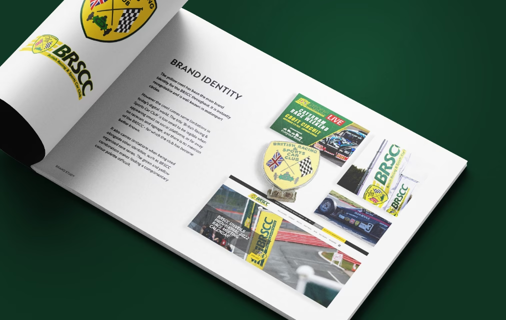
The board absolutely loved the rollout, thank you. It was a daunting thing to rebrand when there was so much heritage in that old crest but you have given us an identity that still means a lot to those who love the club, while bringing us fully up to date. Thanks to all the team at Nu Image.

Paul McErlean
Chief Operating Officer at BRSCC
The Results

It was then our task to create final artwork for all logo versions, before developing the brand guidelines into a full working document for their team and all creative partners to use.

We also created a social consultancy document detailing how and where to apply the brand throughout race meetings and in between. The existing website was updated to incorporate the new logo, fonts and colours and the rebrand was announced to the community with a short video transitioning from the old brand to the new.

The Results

The rebrand was launched at the start of the 2021 season, and was well received by the team members, board and customers alike. It placed them firmly at the top of the UK motorsport echelons and further cemented their position with corporate partners. We have continued to work with the BRSCC as technical and creative partners ever since. Aside from creating all new series identities and branding their annual ‘Driven by Racing’ events, we have also developed a fully bespoke CRM system which manages all memberships, race series, event entries and legal documentation – even distributing all competitor details and medical records to each circuit prior to a race weekend.


If you enjoyed exploring this portfolio, we’d be delighted for you to share it with others. And if you’d like to see how we can deliver similar results for your business or project, please don’t hesitate to get in touch, we’d love to discuss what we could create together.

Ben pointing at the camera

Ready to grow your business?

If you’re ready to take the next step, speak to a member of our team today and we’ll work with you to get started on the first steps.

    Step 1 of 5 I'm looking for...

    Step 2 of 5 Your details

    Step 3 of 5 More details

    Step 4 of 5 Any other notes?

    Step 5 of 5 How did you hear about us?