User journey on-site is an ever-evolving concept and it’s our job to keep up with this. Recently, our Creative Director Ian felt it was time to revisit the best practices behind structuring an ecommerce navigation and customer journey. So, as we do with everything, we thought this the perfect time to share what we learned with you.
A clear navigation bar is the backbone to any site, especially for ecommerce sites where users frequently wish to browse through the products on offer. Therefore, it’s essential to make sure you get it right. But, the big question is how? And, that’s where we come in.
First things first, what is a navigation bar?
If you have a website, you’ll likely already know what a navigation bar is. However, if this is your first time hearing the phrase… Simply put, a navigation bar is the bar that sits at the top of your website pages, engineered to provide users with a starting point and way to navigate around a website. Like a key to a map. From the navigation bar, a user can click on whichever service or product category they want to see more of and are subsequently taken to a page specific to that.
Pretty handy, right? Well, users certainly think so. Therefore, by default, so do we.
Why does it matter what my navigation bar looks like?
As with most decisions, it’s all about user experience and first impressions. If a user can easily operate your website and achieve the end goal they were looking for, this will equal to a higher conversion rate.
The reasons behind this logic being:
- Having a navigation bar can save precious time in getting a user to the end point of their journey. A user will only stay on your website for a limited amount of time, it’s common for users to become frustrated if they’re having to hunt around your site to find the answers they need and that’s where you can lose them. A well-structured navigation is tailored to get users there in as few clicks as possible.
- Users have certain expectations for websites when they first land on them. Just as most users would expect to see the company logo in the top left hand side of the site, it is also an expectation to see a navigation bar stretch across the top of the page with navigation links to pages such as About, Services, Product Categories, Blog, and Contact for example. Whilst fancy flourishes certainly have their place online, the MAYA (Most Advanced. Yet Acceptable.) principle teaches us that any advances need to be easily embraced by the majority.
What are the best practices for an ecommerce navigation?
Simplify the options
One of the key decisions for any navigation bar is what to keep in it and what doesn’t need to be introduced at this point. Ecommerce sites tend to fall on the larger side and trying to list all products at the navigation stage is impossible, categorisation is your new best friend.
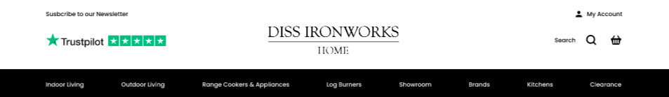
Take Diss Ironworks for example. Their lifestyle appliances and homeware store sells a large selection of indoor and outdoor living and accessories. A user may come to the site looking for a luxury range cooker but they may not have quite made their mind up on which one yet. It’s important the navigation guides them towards a final decision, not make it for them. Therefore, the range cookers category should be clear to see, navigating the user to a page where they can browse the full range and narrow this down to options that suit the space and style they have at home. Presenting users with this level of freedom means they could end up with a completely different product to what they originally thought they wanted, and encourages upsells too.
Direct the user’s focus
It’s not always possible to remove everything from the navigation bar in order to result in a neat, single row of links to other pages. Therefore, it’s key to draw the focus towards the most important links in the navigation bar for the user. A strategic design choice such as choosing an eye-catching background colour and keeping your ‘less important’ links on a white background is one way to achieve this.
The goal of any ecommerce site is to guide users to that all-important sale and the navigation bar plays a big part at the start and throughout this journey. Getting it right can result in a soaring conversion rate.
Need help with a UX-focused web design that clearly communicates your main product categories? Give us a call on 01603 859007 or send us a message via our website’s contact form for a discussion on how we can work together.