
We’ve been lucky enough to have worked with Garden Centre Overstrand (GCO) for a few years now so you can imagine our absolute delight when Victoria, owner of GCO, asked us for branding, a new logo design and a new website to match!
Victoria’s goal was to modernise the brand using a more minimalistic approach, with that in mind, we got to work creating a new logo and branding with subtle, earthy colour palettes to do just that.
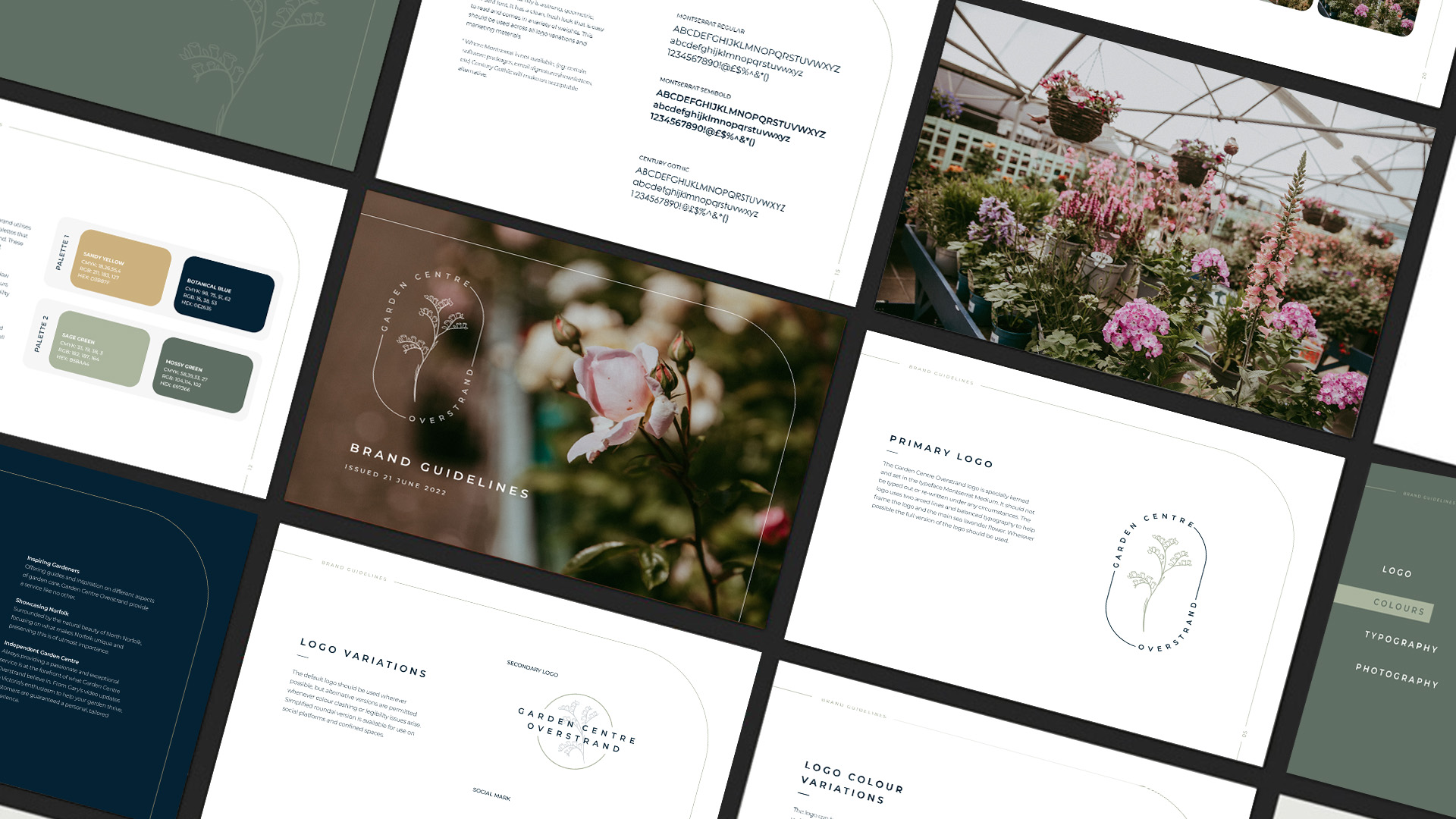
Logo design
The development of the logo was a team effort, our studio assistant Jess carefully hand drew the illustrated sea lavender which sits in the centre of the logo. The flower is reminiscent of vintage botanical prints and the perfect fit for GCO’s aesthetic. The flower of choice was originally selected due to their proximity to the coast and in line with their given brief for a minimalist and rustic approach. Little did we know, copywriter Phoebe discovered that in Victorian times the gift of sea lavender represented remembrance. Upon learning this, Victoria shared how this ‘struck a chord’ as she had been gifted the garden centre by her late father and that the rebrand of the centre symbolised a new chapter, reinforcing the decision to focus the branding around this.
Once the illustration was provided, our designer Jordan pulled all the individual elements together to create the final product. Our thinking was that the pill-shaped logo would work nicely as labels throughout the garden centre itself; it is specially kerned and set in the typeface Montserrat Medium. Both logos use two arced lines and balanced typography to help frame the logo. The circular logos are used for digital formats, signage, embroidered workwear and packaging stickers. A versatile design for a multitude of uses.
Branding
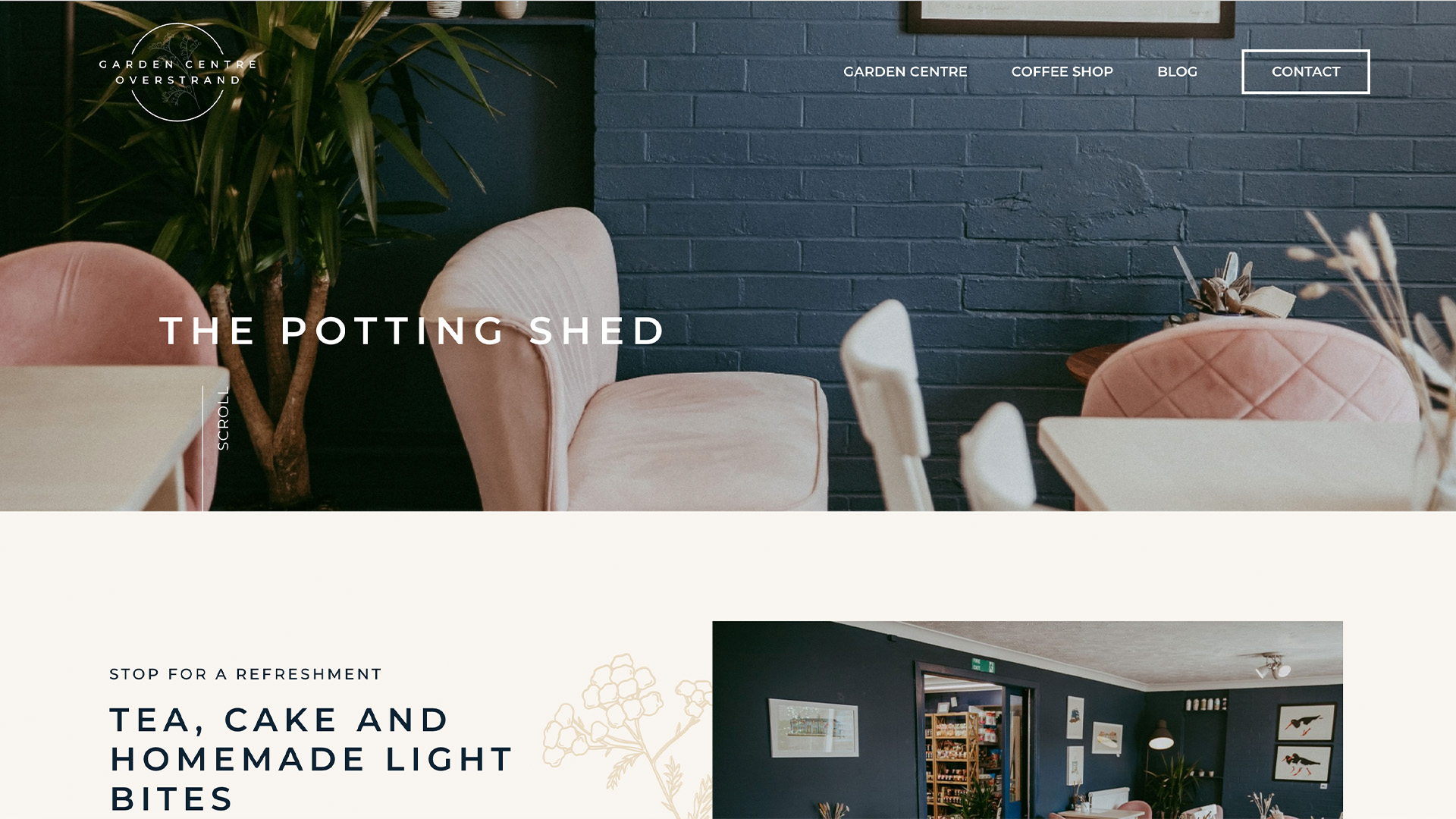
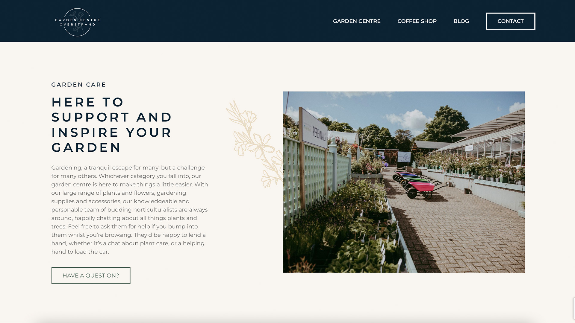
Much of our branding was based around the wonderful photography provided by Mim Howell (Instagram – @mimhowell), we included the imagery within the brand guidelines to ensure that we created a cohesive guide to truly encompass what makes GCO unique.
We chose to have two colour palettes; colour palette one uses Sandy Yellow and Botanical Blue colours, whereas colour palette two uses Sage Green and Mossy Green. The decision behind these colour palettes derived from their ability to draw attention to certain areas of the design that work to compliment each other, and are used throughout the website to create a fresh modern look. Allowing for a calm entrance and browsing when you land on the site that mirrors the experience of visiting the garden centre itself. The earthy tones used in the colour palettes and Mim’s photography bring the brand image together, creating a coherent brand that is recognisable.
For the typeface, we wanted something which complimented the minimalist boho style of GCO, so we decided on the Montserrat family. A strong, geometric, san-serif font known for its clean, fresh look that is easy to read and available in various weights.
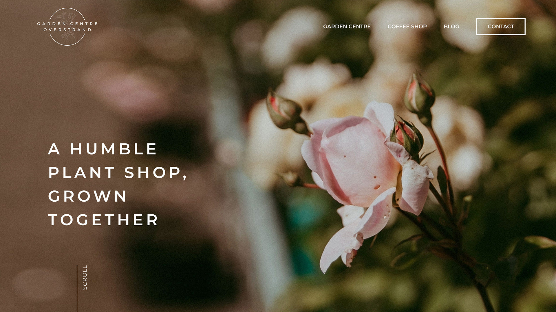
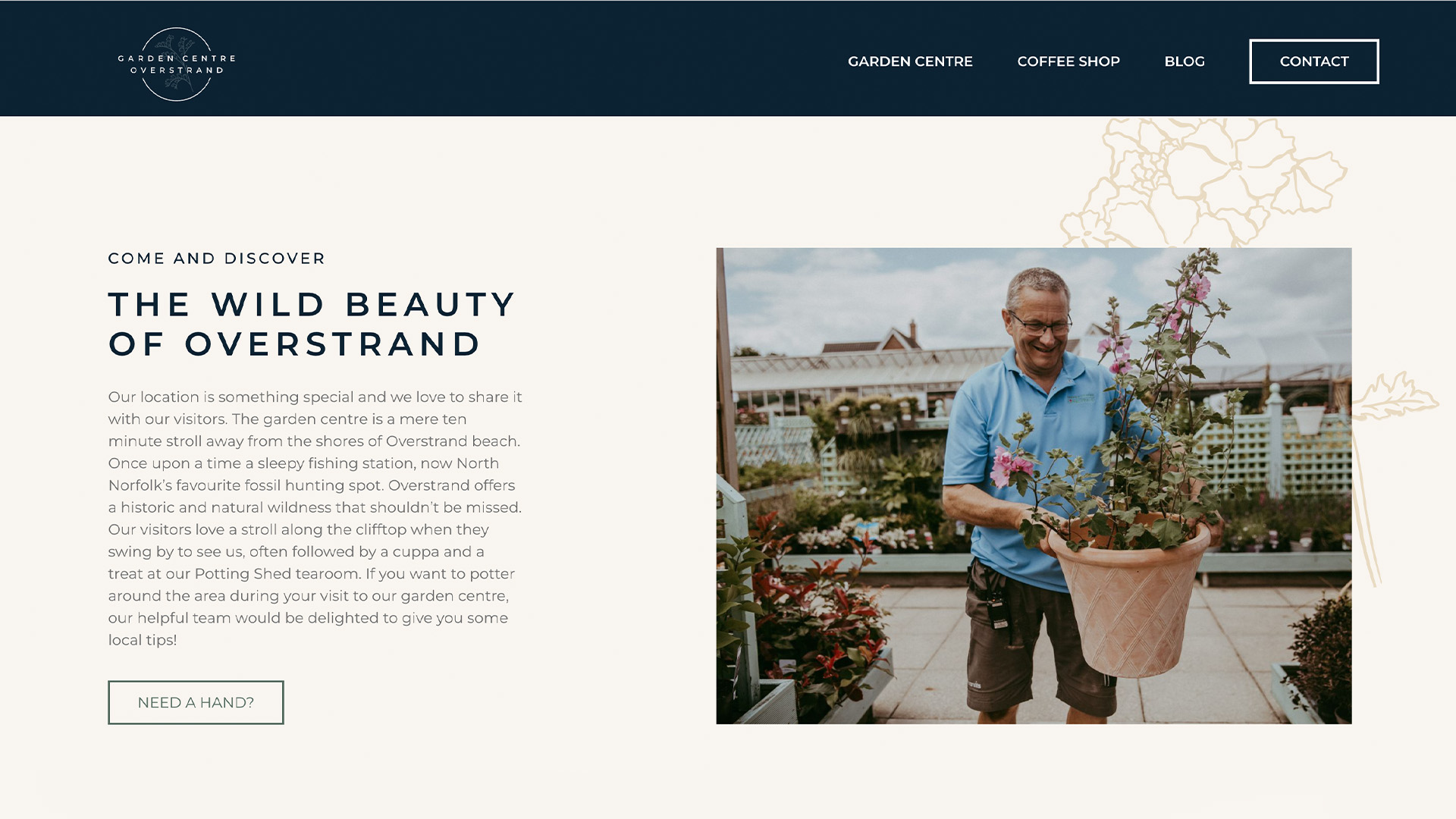
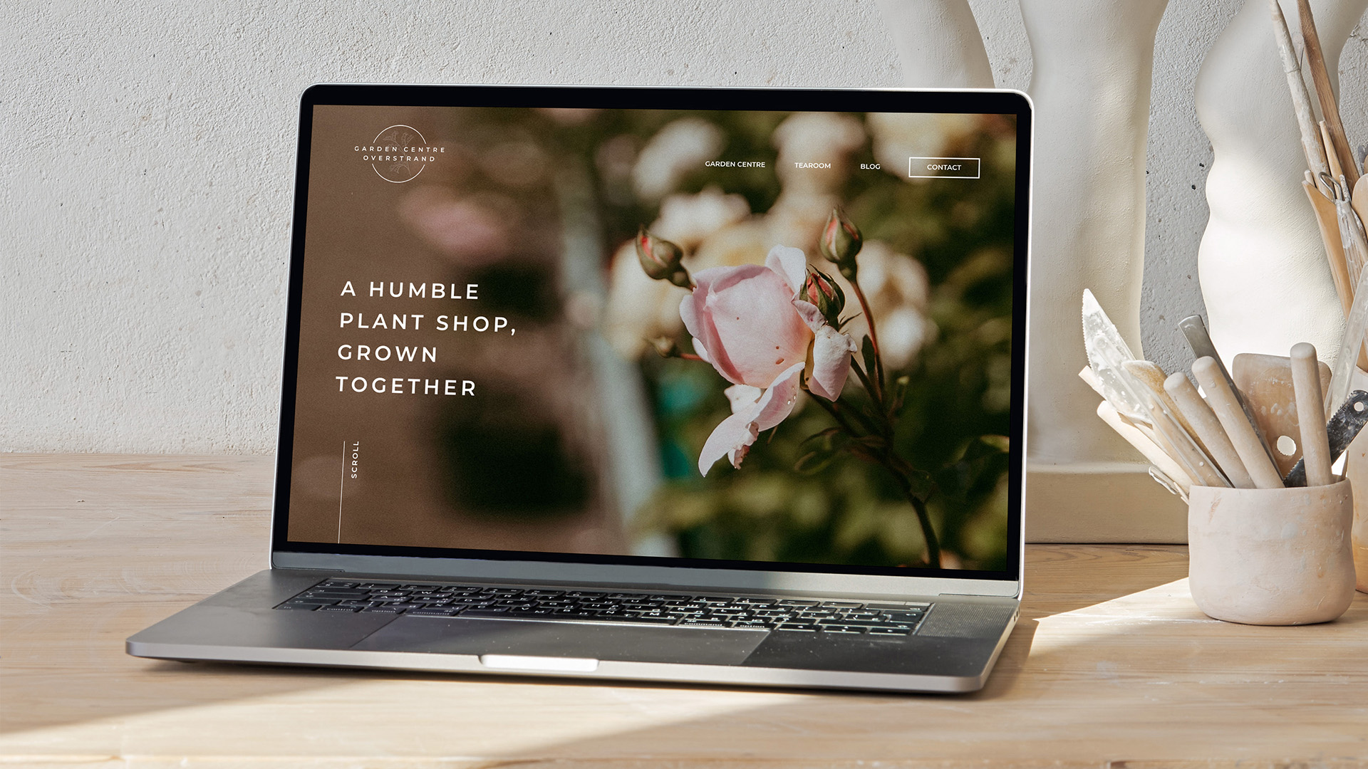
Website
Jess’ illustrative talents didn’t stop with the logo, we incorporated them into the background of the site allowing elements of the brand to flow more freely. It’s a subtle element which ties the website together and provides a layer of luxury.
Again, we wanted the photography to be the main focal point of the website, showcasing the personality of the garden centre and team behind it, as well as the products available. We ensured that all images used on the site were authentic photos of the garden centre, with no stock imagery anywhere to be seen.
Vitoria was keen to provide tidbits throughout the website that would support customers even after their visit to the garden centre. Therefore, a step by step process detailing how to create a sustainable garden was made readily available on the site, and Jordan and Jess collaborated on bringing a printable 12 month planting calendar to life.
And to bring it all together, the copy, we’re pretty proud of this one. Digital marketing executive Phoebe kicked it off with a casual catch up over Zoom to get to know Victoria and what makes Garden Centre Overstrand who they are. Phoebe did a great job to capture the essence of the garden centre, its location and history, and the team behind it. So much so, there were no amends or changes needed after the first draft, a job well done indeed!
Related Projects


What next?
It’s safe to say that we have loved how collaborative our team has been on this project! We’ve had a blast putting our creative heads together for GCO and working closely with the lovely Victoria. If you find yourself looking for a website, logo, copywriting or a brand presence that clearly communicates your business then give us a nudge!?